Let's Chat About Design System Tokens
Overview
Design Tokens are one of the core elements of a design system. They are the smallest sharable pieces and provide a way to increase consistency and speed up the design process. In this article, we'll review the basics of Design Tokens, including what they are and how they can be utilized to make your design system more scalable. No matter your role, if you work on a design system, it is critical to understand the part they play.
The Basics
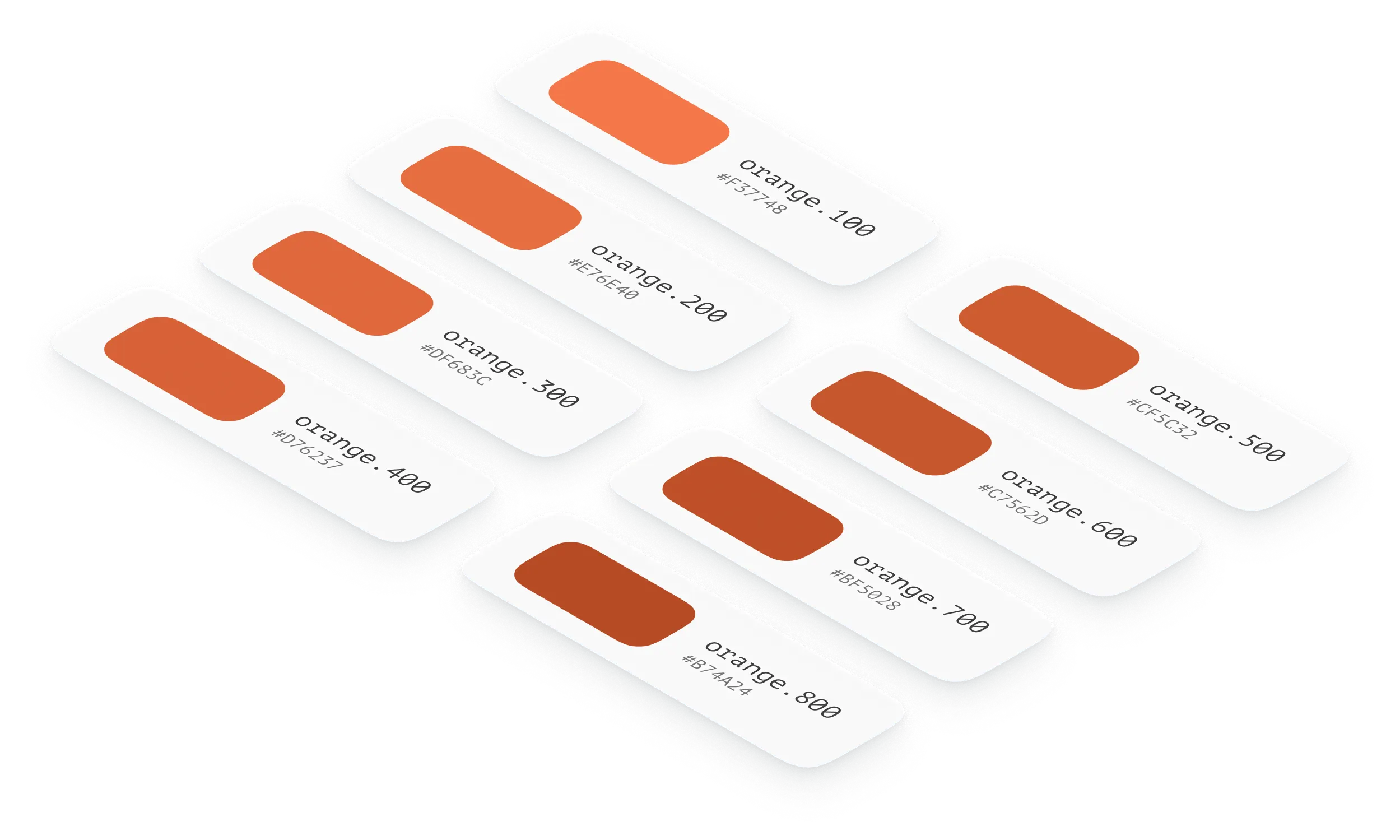
So, what are Design Tokens? At their core, they are variables that hold a value. Later, that value can be referred to by a name, providing a quick and easy way to reference its contents. An example of a Design Token might be something that stores a colour hex value or a specific font size. When we use these in our design or code, we refer to them by their name, not their value, allowing us to change the token's value quickly and have it reflected across our entire design system. If we worked purely in hex values every time we wanted to change a colour, we'd have to find every instance of that colour and adjust it manually. Depending on the breadth of your design system, this could be a lot of work and creates room for error.
Using the variable name makes this much more tolerable. We can instantly update and reflect the variable's value across our entire system. We can also have variables reference other variables and even have them perform computations.
There's numerous tools available when it comes to managing Design Tokens, a few of those being Figma Variables, Tokens Studio and Style Dictionary.
Different Types of Tokens
Now that we have the basics let's go over some of the types of tokens you'll commonly encounter in a design system and their purpose. These are popular concepts, and there's no defined standard for naming them. Your design system may use a different set of tokens or methodology.
Global or Base Tokens
These are your primitive values. They are often brand-specific and contain colours, font sizes, font weights, spacing, etc. Almost every other token will reference these in some way or another. Some common examples may be orange.300 or size.200, which refer to hex and size values in your brand's style guide.
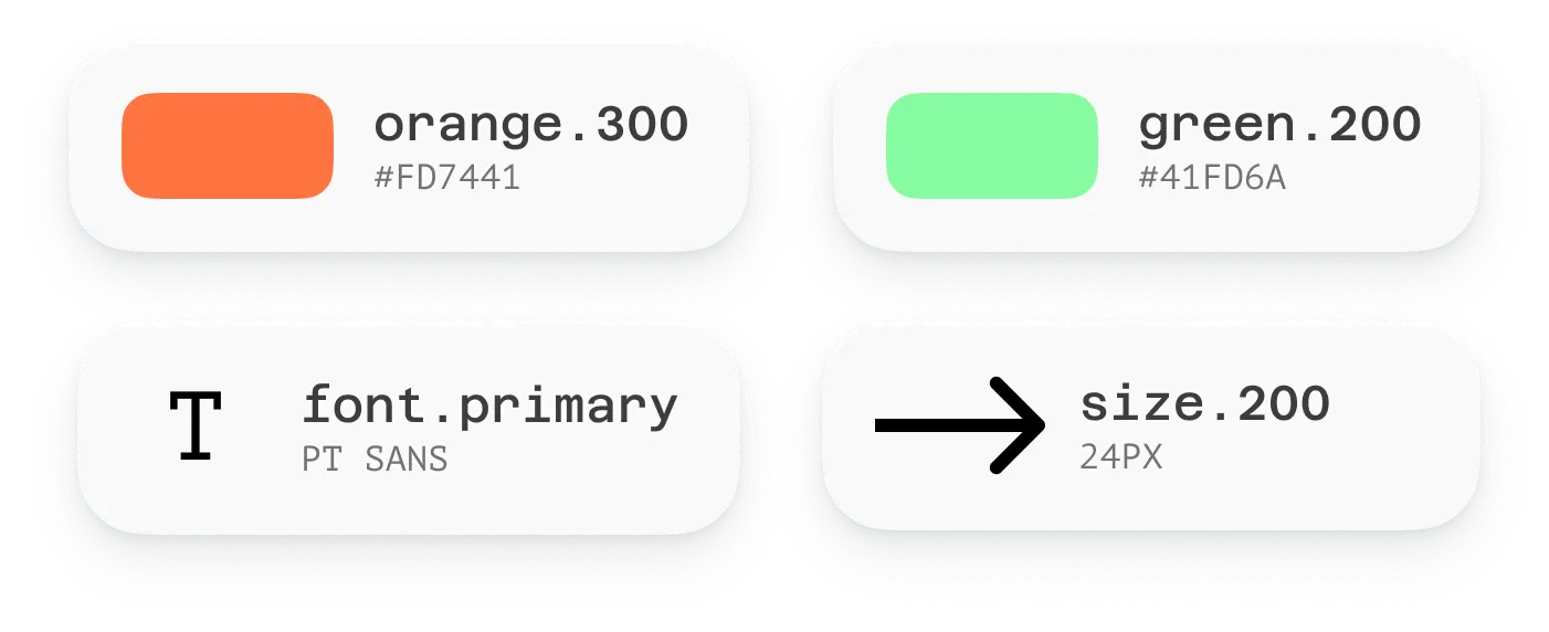
You'll likely have multiple sets of these tokens if your design system supports numerous themes or brands. For instance, you may have a bunch of tokens for your light theme, another for your dark theme, and so on.
Alias or Semantic Tokens
Alias tokens (also known as semantic tokens) create a relationship between a global token and a specific context. Alias tokens are the connective tissue that begins to form opinions about how your designs should look and feel across your ecosystem of components. For instance, your system may decide that all surface areas should have a specific background colour. As a result, you may have a token called color.surface.background, which references a global token. When applying a second theme, the referenced value that the color.surface.background token points to may change, but the decision that all surface areas should have a shared background colour remains the same.
Similarly, for sizing, you may decide that the border-radius on all your cards should be the same, causing you to create border.surface.radius. This token would reference the global size.* tokens, but the size ramp for each theme may change. For example, in a multi-brand system, size.200 could be 4px for brand a and 8px for brand b.

The purpose of opinions like this is to make it easier to decide on which established pattern to use when designing, as decisions become shared across similar component types. If you're creating a new component, you don't need to think about the border radius or background colour if it falls within that given context, empowering you to make faster decisions by reducing the cognitive load.
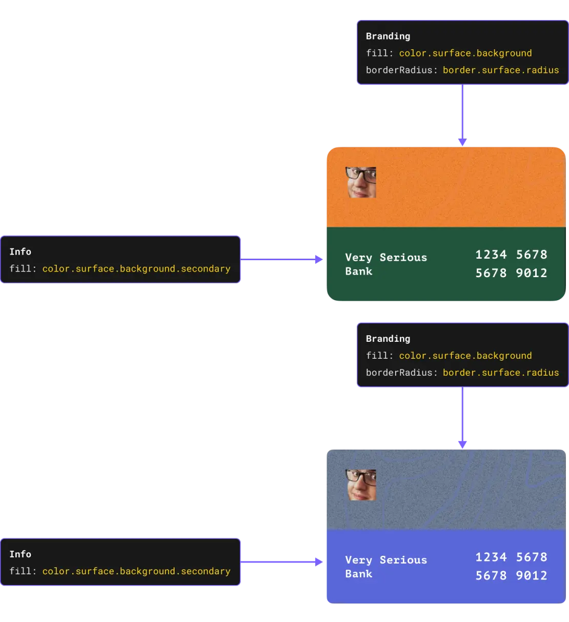
In an ideal world, all you'd need to do to create a new theme is apply values to the alias tokens, and the rest of your system would update accordingly. Any new components you make would automatically inherit the values of the alias tokens, and you'd get a themed version "for free". With that in mind, you'll want to find the sweet spot of just enough alias tokens to make it easy to design but not too many that it becomes difficult to maintain.
Component Tokens
These tokens refer to specific components in your system and outline how they should look or feel. For instance, you may have a card component with a background colour, border radius and shadow; these tokens define their style. These often use alias tokens to determine their default values. One added benefit to having these is that these types of tokens provide an escape hatch where you can override specific system-level decisions that don't work for a particular theme. They also offer a way for us to create a shared language between designers and engineers and make it easier to communicate how a component should look or feel across different implementations.

These types of tokens are not a replacement for a sound component hierarchy. For example, suppose you create many of these tokens to handle variations in layout or specific props; you may be better off building a new component or variant instead or investing in a more robust component system that utilizes something such as atomic design principles to provide a better hierarchy of how different types of components interact. Tokens do not solve every single problem, but combined with other best practices, create a way for your system to be incredibly robust.
Visualizing the Structure
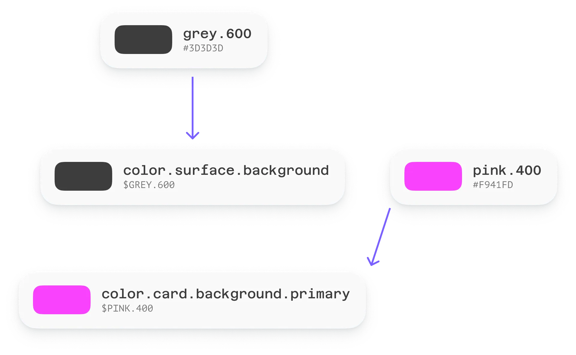
When we look at the structure of these tokens, we can see that they form a hierarchy. This hierarchy is important as it allows us to create a scalable system. We have a mixture of theme (or brand) specific tokens, followed by shared design decisions with our alias tokens, and then component-specific tokens that provide a recipe for how a component should look or feel. The following highlights how a single decision change at the alias token level adjusts the whole structure.
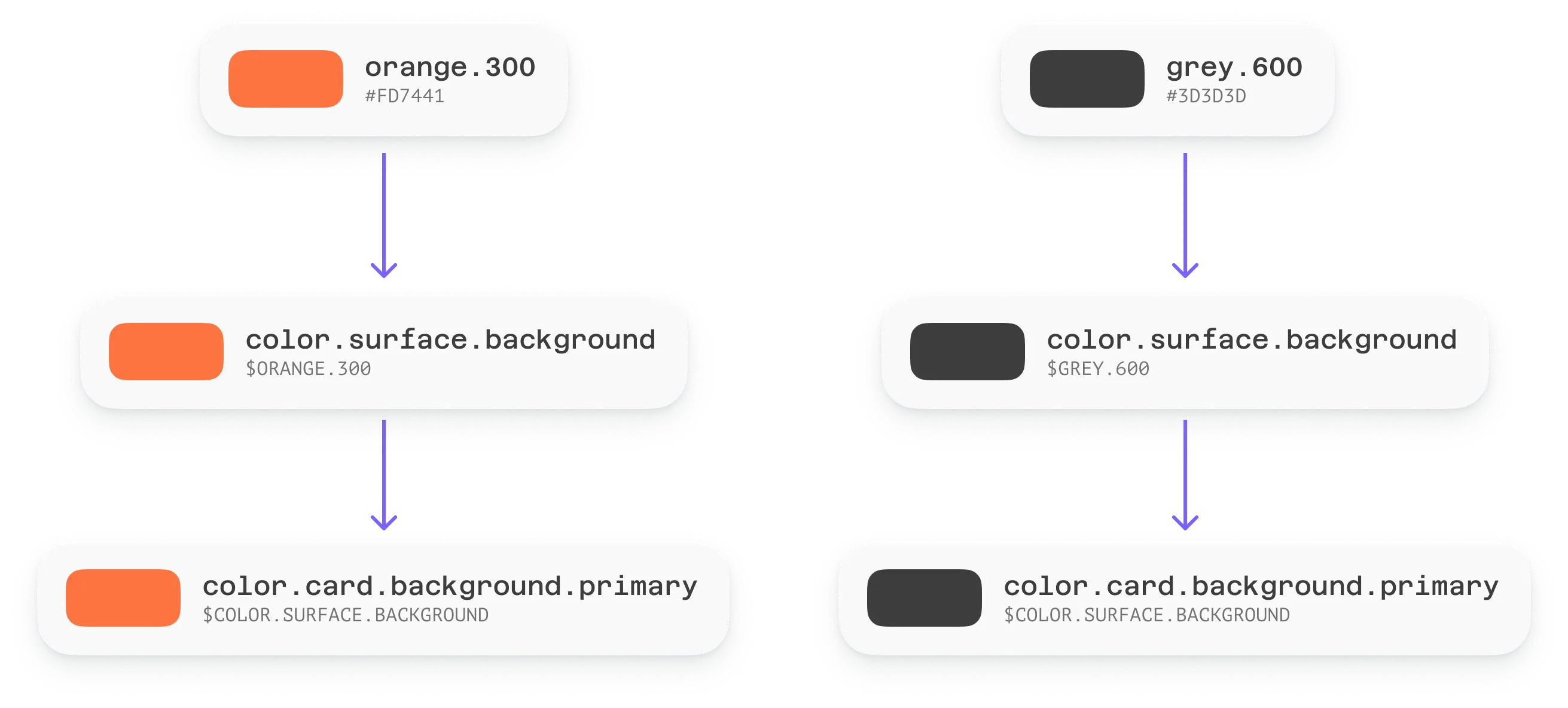
Similarly utilizing component tokens we can override the decision in a single place without effecting the entire system.
Naming Conventions
Your Design Tokens must be named in a descriptive, concise, and consistent way. There are many philosophies to this, but a common one I've seen utilized is splitting them up by categories, for example, [system].[category].[concept].[component].[variant].[state].[scale]. You move from left to right, optionally populating each part until you formulate a descriptive name for your use case. Nathan Curtis does a fantastic job of breaking down this concept in his article "Naming Tokens in Design Systems" and goes into far more detail.
Design Token Naming Tool
If you'd like to play around with naming tokens, I've created a tool to generate token names based on the above patterns. I've populated this with a few examples you can use as a starting point. If you'd prefer to run this locally I've pushed the code up to GitHub here.
This naming system is relatively straightforward, although you may need to tweak it to fit your needs. You may need to add additional sections or types to the hierarchy. It's also important to note that while there are no standard naming conventions for tokens, a W3C working group has a draft that makes some suggestions. Keep an eye on this as it may become the standard, and tools may start to enforce how they work with tokens based on future published material.
Conclusion
Design Tokens are a powerful tool to help you create a scalable design system. While they sometimes seem complicated, it is important to remember that they are simply opinionated variable names. Every system will be different, and there's ultimately no set way of implementing them. Use what works best for you and your team. If you have any questions, please reach out. I'd love to hear from you!
Related Reading
Want to learn more about Design Systems? Check out some of my other articles below.
- Syncing Figma Variables and Style Dictionary with GitHub Actions
- Engineering Design Systems in 2022
- Creating the United Income Component Library
Thank you once again to Melissa Eckels for peer reviewing and editing yet another one of my articles.