Creating the United Income Component Library

Overview
For some time now United Income has been working with the React framework to build components for our web applications. Like most projects, scope and requirements change over time, which, without careful planning from an engineering perspective, can result in repetition of code and a deviation of styling and functionality. We were building quickly and creating variants of the same component time and time again, which created problems for the team navigating and figuring out what we’ve already built and what we haven’t.

As both our team and company scale we decided the present would be as good a time as ever to to come up with a solution for this.
We wanted to:
- Improve the way we build components, focusing more on re-usability and stylistic consistency across our web applications.
- More closely align our engineering workflow with our design team, as they already build in small components using a design system manager which breaks down pages into their own individual components.
With these goals in mind we began a first draft of a component library during one of our quarterly innovation sprints. What is an innovation sprint? At United Income that’s a week where all our teams can work on anything they want so long as it’s tangentially related to our company and its mission statement. During previous innovation sprints we’ve created things such as Slackbot Destroyer and json-syntax.
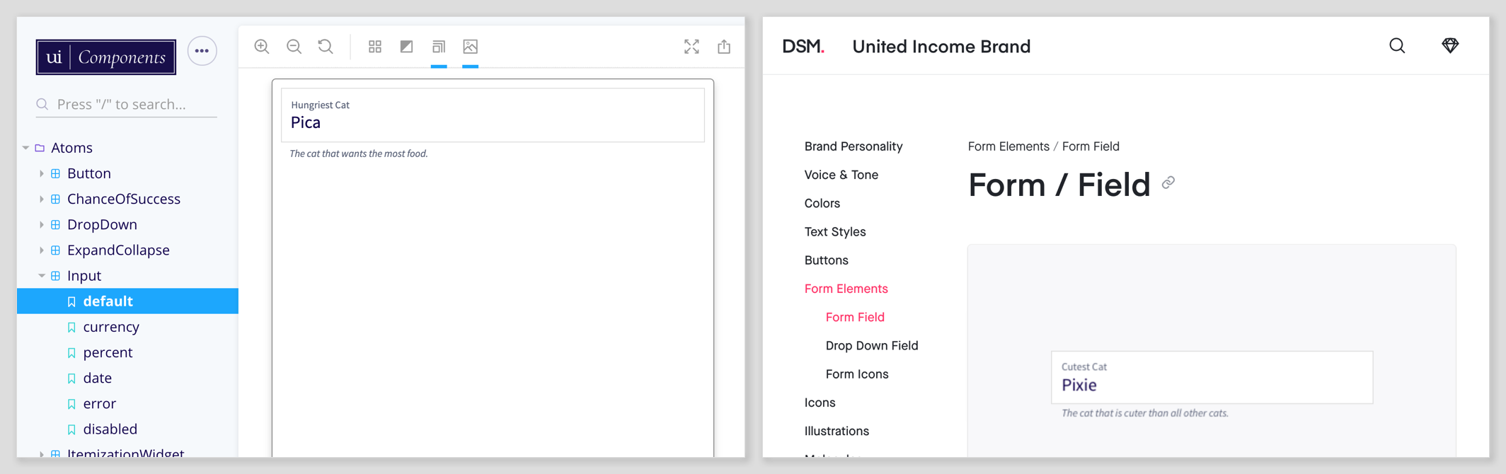
Using a component library would allow us to develop our components outside of our main application, allowing us to formulate best practices and keep track of any regressions in a programmatic manner. We decided to use Storybook as there’s a lot of support for React and other component based frameworks such as Vue and Angular.

Forming Best Practices
As we built out our component library we decided on a number of best practices to introduce into our engineering and review process. Some of these best practices come from experience, and others out of necessity. Taking on this project gives us a chance to do things differently, freeing us from any constraints we had created as we learned more about React over time, providing opportunity to make positive changes without having to re-do everything at once.
Here’s a few of our best practices we’ve introduced:
Components shouldn’t enforce exterior spacing.
When you create a component, that component should be able to be used for as many applications as needed. If the component requires additional exterior padding or margin that shouldn’t be added to the component itself, instead it should be added through an inline style or class when importing it. This prevents the need to create duplicate variants within the component library which apply to the component in one specific scenario. As a rule of thumb we always pass through a style and className prop to the parent element of all components in our library. The exception to this rule is when creating a template which includes either an Atom or a Molecule, these can have their own internal spacing classes which affect the exterior spacing of another.
All components should have prescriptive PropTypes.
We want to make sure that we can self-document our code using PropTypes, even going as far as creating and using custom ones when needed. We also require comments on all of our PropTypes so they can be documented using storybook/addon-info and react-docgen.
Modal.propTypes = {
  /** The name of the modal. */
  name: PropTypes.string.isRequired,

  /** The button to display which will reveal the modal. */
  label: PropTypes.node,

  /** The contents of the modal. */
  children: PropTypes.node.isRequired,

  /** Prevents the user from closing the modal.*/
  preventClose: PropTypes.bool,

  /** Handles the change event of the modal. */
  toggle: PropTypes.func.isRequired,

  /** Determines if the modal should be displayed or not. */
  show: PropTypes.bool,
}
All components should have 100% test coverage.
As we’re building component stories and variants with limited scope, we decided to enforce the rule of full test coverage. Combined with integration testing we can dramatically limit the chance of unexpected bugs making their way into our production code. We also enforced a number of linting rules, including those which cover accessibility concerns.
CSS should be namespaced.
This prevents class name clashing when used in our applications. To achieve this we wrap all of our components in a class name which describes the component such as .uic--ui-loader, and then have additional class names cascade. At first we wanted to auto prefix our class names using css-modules, but ultimately ended up doing it manually as we weren’t able to run some of our external dependencies through it which power our grid and other utility classes.
.uic--ui-loader {
  height: 200px;
  margin: 0 auto;
  width: 75px;

  svg {
    height: 200px;
    width: 75px;

    &.loader-icon-top {
      animation: bouncing 0.5s infinite alternate;
    }
  }
}
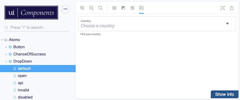
Stories should be staged appropriately.
Storybook provides a way for users to click through all the different variants of a component. These are called stories. In the case of a Dropdown component it should have a story for its closed state, open state and any other type of state such as error. This allows us to easily see the visual variants of the component, and ultimately run visual tests against them.
The following example shows one of our illustration components which has multiple different color states.
stories.add('default', () => (  <RamenCircleIllustration />));

stories.add('color', () => (  <RamenCircleIllustration color />));

stories.add('draft', () => (  <RamenCircleIllustration draft />));`
Structuring a Component
All of our components within the library are structured following Atomic Design principles. Any kind of basic component is an Atom, and things with more complexity are either a Molecule, Organism or a Template. We structure our components folder as follows.
•
└── components
├── atoms
│ └── Input
│ ├── Input.js
│ ├── Input.md
│ ├── Input.scss
│ ├── Input.spec.js
│ └── Input.story.js
└── molecules
└── organisms
Each component has a series of files associated with it: in most cases a JavaScript file with the exported component, a README file, a spec file for testing, an scss file for styling, and a story file which renders the component within Storybook. While we require our PropTypes to be commented, we also include things such as implementation specific instructions within the README. Our goal is to make the library as appealing as possible for our team so they are encouraged to both use it and contribute to it.
As the component structure is predictable we even came up with a way to automatically generate a new component using a node module called hygen. This allows us to simply type yarn generate in the terminal and answer a few simple questions to get a boilerplate up and running for a new contribution.
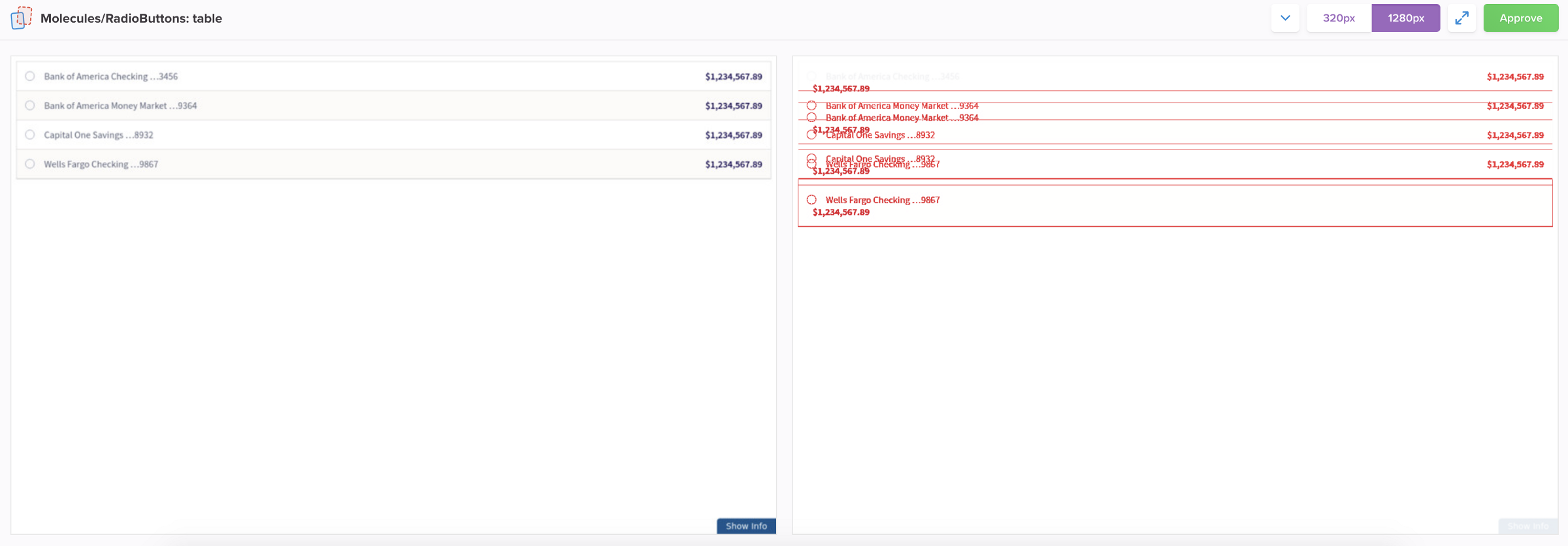
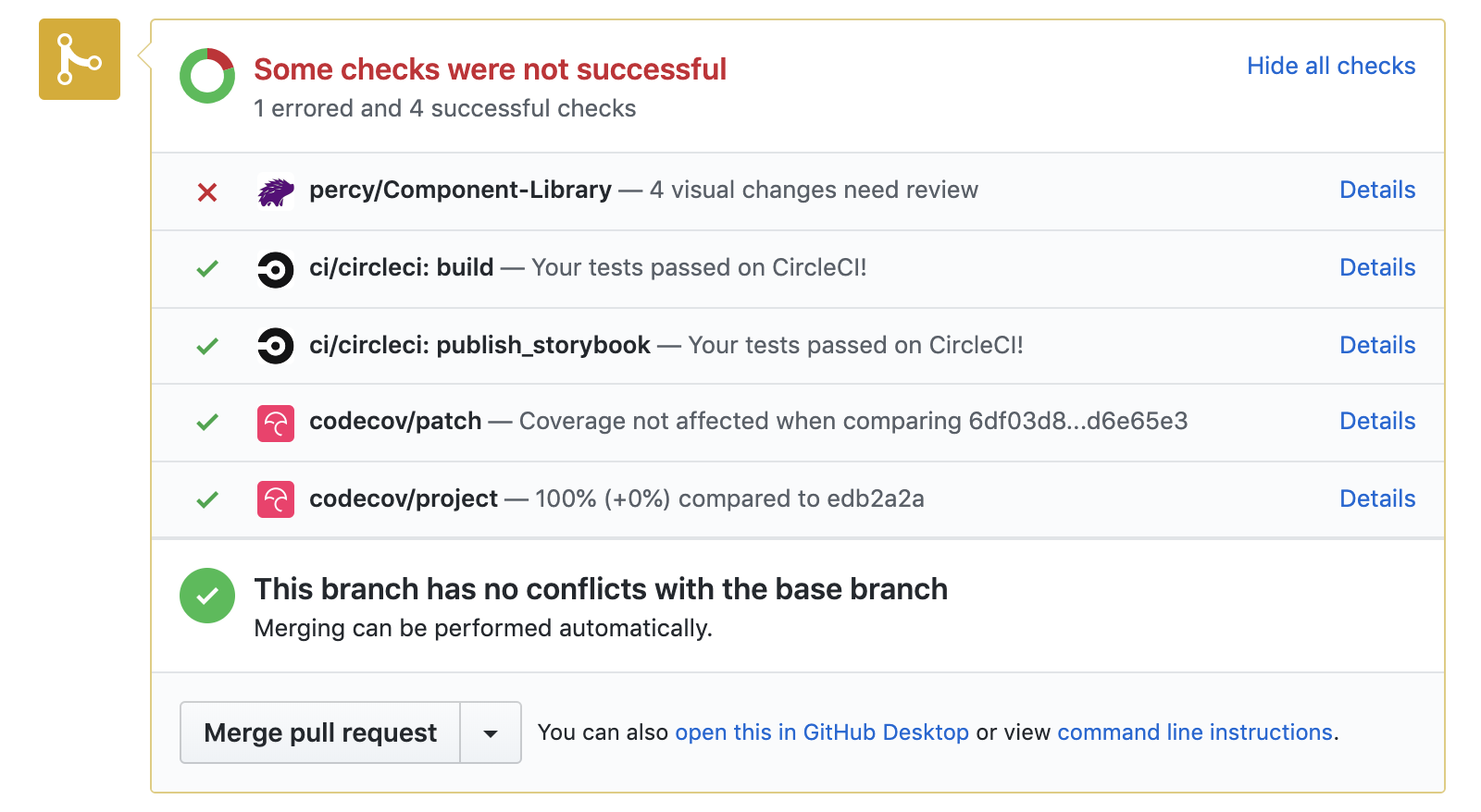
Visual Testing Deployments
One of the biggest nightmares of working with CSS is having to deal with visual regressions. Too often someone changes a single line of CSS, and it creates a visual change which goes unnoticed for days, sometimes even weeks. As we stage the components and their variants in their stories we can use these consistent states to create a visual diff on each release, allowing us to keep track of visual changes. Combined with namespaced CSS and 100% test coverage, this allows us to release with confidence each and every time.
For our snapshot testing we use an integration called Percy to keep record of how our components are changing. Setting it up to work with Storybook occurs in the Storybook initialization file.
// Grabs all Stories
const req = require.context(
  './images/blog/2019-06-03-creating-our-component-library/components',
  true,
  /story\.js$/,
)

const { percyAddon, serializeStories } = createPercyAddon()

function loadStories() {
  req.keys().forEach(req)
}
// Initializes the Percy addon.
setAddon(percyAddon)

configure(loadStories, module)

// Serializes the stories so Percy can access them.
serializeStories(getStorybook)
For stories with animated elements, we can tell Percy to skip the visual diff testing as it would flag it on every review. We mostly have to do this for components which have animated SVG’s such as our loading spinner.
stories.add('default', () => <Spinner {...defaultProps()} />, {
  skip: true,
})

We configured the snapshot script to only run when a pull request is made from our develop branch to the master branch. We did this as that’s the final push in the chain before a new release is cut, which ultimately makes its way to our production build after being published to npm. We also felt it was overkill to test on every push to the develop branch as we tend to move quickly and sometimes merge work in progress pieces.
If a visual diff is found, the pull request gets blocked (similar to how other CI tools work) and it flags our designer to sign off on the changes before the merge request gets green-lit.
What We’ve Learned
We’ve learned a lot while creating this library, below are a few key points.
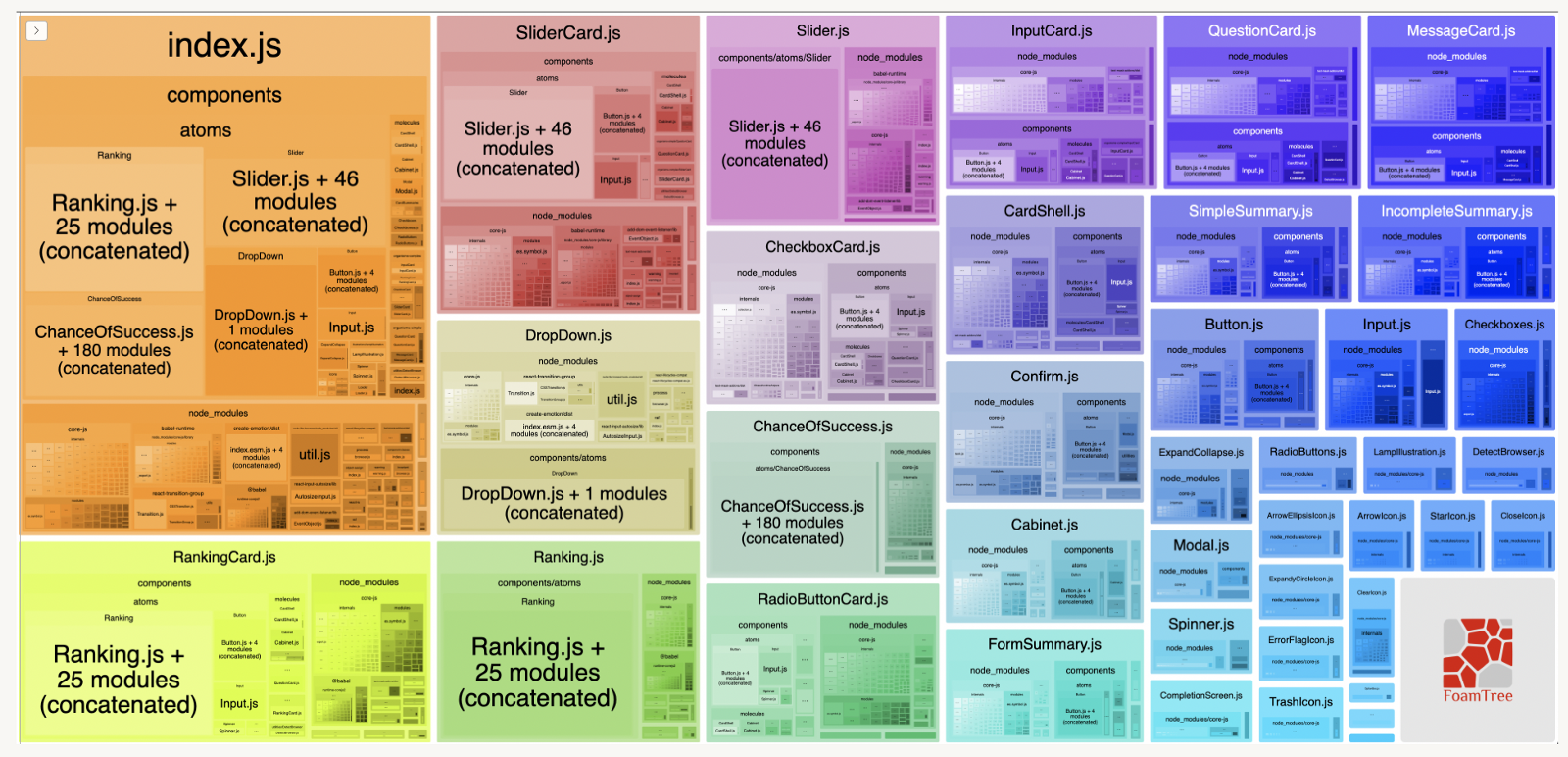
Managing dependencies correctly can be difficult.
Managing dependencies appropriately was a lesson we learned quite quickly, when we discovered that duplicated dependencies were making their way into our application through our component library. After auditing our component library module with the webpack-bundle-analyzer tool we discovered the entire lodash library being included many times. This resulted in a lot of bloat making its way into our main application which began causing performance issues.
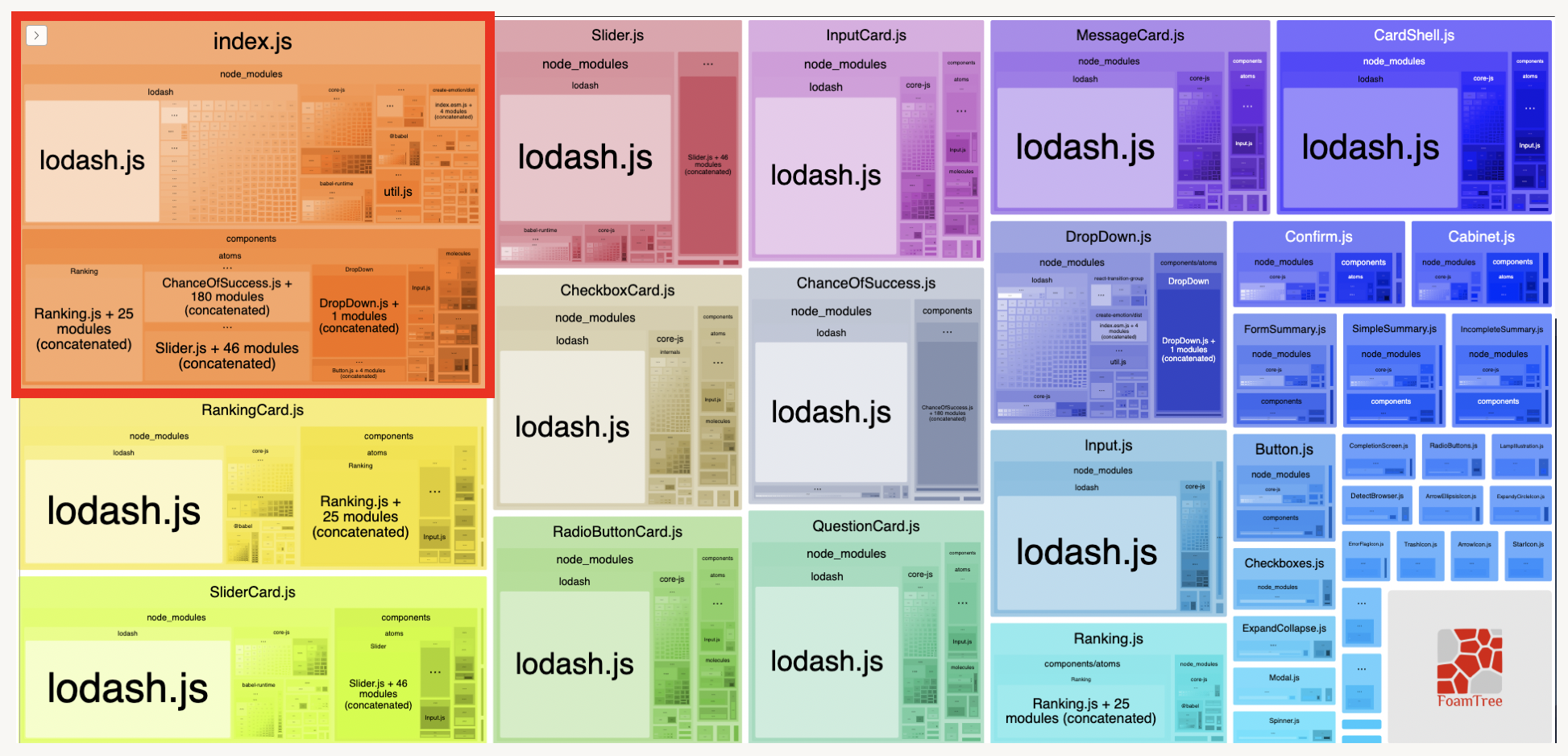
Correctly marking modules as peer dependencies and marking the modules as external in our Webpack configuration helped resolve this.
Making sweeping changes can be difficult!
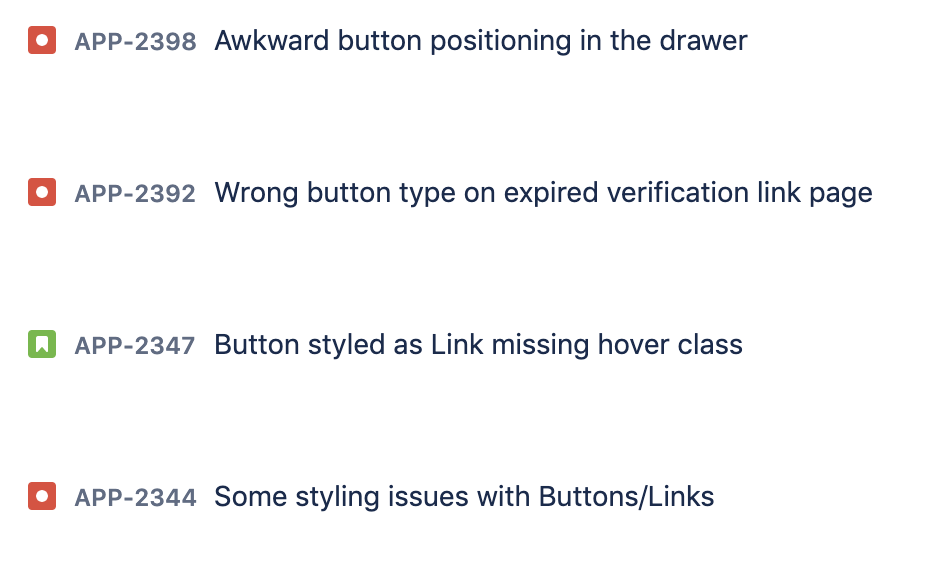
Even though we’ve built out a component library, making changes to existing components within our main application was difficult. The first component we built was a button, and replacing all of our old buttons with the new one required a lot of engineering effort.
We even built our own makeshift visual integration test just so we could get some automated visibility over a number of scenarios in our application to minimize the impact of replacing this one button component which was referenced over one hundred times. Our visual diff tool was similar to how Percy operated, except took a snapshot with Puppeteer every time our Selenium tests paused, it didn’t work great and therefore didn’t make its way into our deployment flow, but we keep it on the back-burner just in case we need to recommission it.
Even though we jumped through all the appropriate hoops we still needed to hotfix a lot of issues. Fortunately we expected a degree of that and tried to prepare ourselves as much as possible.
Closing Thoughts
Overall creating a component library was a positive experience, and we’re excited about the benefits it will bring to how we build components at United Income going forward. We’ve decided to open source our component library as we believe it could be helpful to others. You can view the code on Github here, and an archived version of the Storybook instane here. 🎉