Engineering Design Systems In 2022
Overview
If you've designed or engineered the front-end of an application, you may already be familiar with the concept of a design system. For those who are not familiar, a design system organises a set of guidelines and principles intended to manage design at scale. They are a product in themselves with extremely close engineering and design collaboration which aids in the development of other products. I personally love working with design systems and in this article, I'll break down some of the essential principles of design systems I've learned over the years while working with them, as well as tooling you can use to help build your own.

What is a design system exactly?
So what actually is a design system? In essence, a design system combines both design and engineering recommendations to ensure applications match a specific style and user experience. They also provide a set of commonly used components and patterns which anyone can easily implement. This in turn reduces cognitive load so that the focus can be put on experimenting and solving more meaningful problems. While every design system will have its own set of goals, in many cases they exist to ensure consistency and to speed up the production time of the products that fall under their umbrella. In order to achieve this there are typically three main parts to a design system:
- Style Guide
- Component and Pattern Library
- Documentation
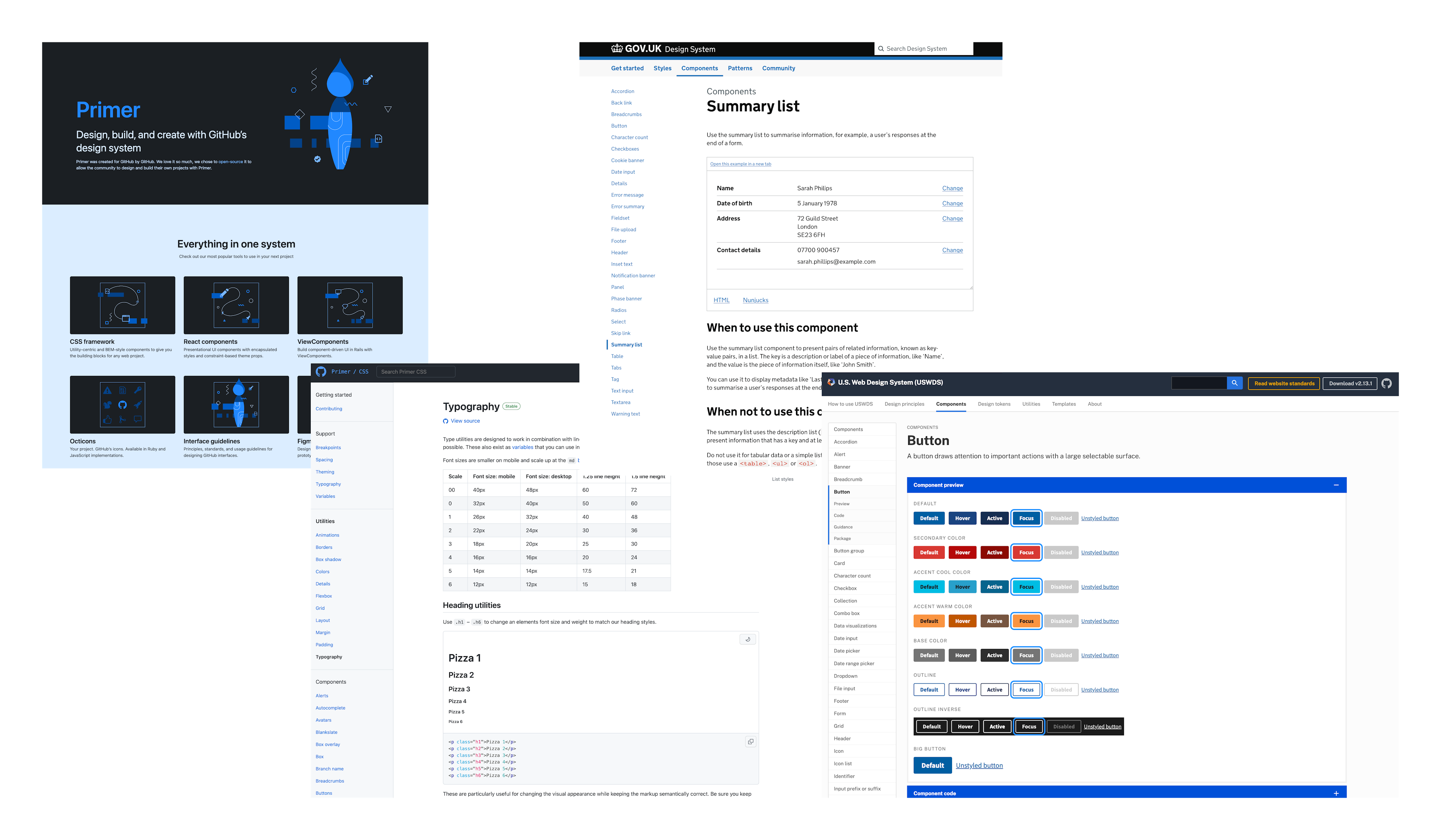
There are numerous examples available on the internet of design systems. Some great ones I've aspired to emulate in the past include Primer by GitHub, the GOV.UK Design system and the U.S. Government Web Design System.
Let's take for example the Notification Banner component from the UK.GOV design system. Not only does the design system provide a centralised location for the engineering implementation of the banner with code snippets, but it also informs you about the parameters for how and when you should and should not use it. With this knowledge readily available, anyone who reads the document can make an informed decision about whether or not they are choosing the right component for the given context, thus providing autonomy to the person using the system. I always like to make the connection that if a design system is cohesive enough, anyone could use their best judgement and create a prototype using it.
Why is this important?
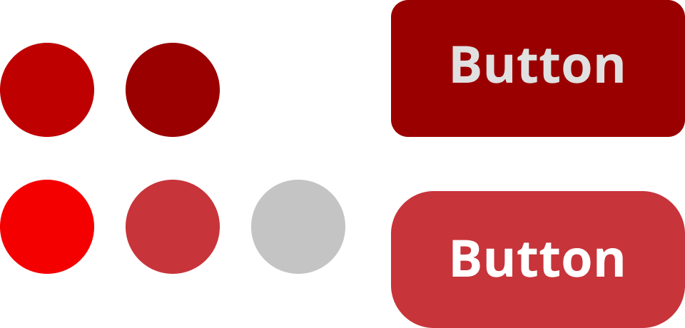
As a team grows and new things are introduced, it becomes easier and easier for inconsistencies to build up. If two adjacent products don't share the same design and engineering implementation, they can stray off course, causing two applications that fall under a specific style to look and feel quite different from one another. From a user's perspective this can be quite frustrating if patterns change depending on where they are in your product. In general, ensuring that everything remains consistent helps build a sense of reliability and trust with your users.
In the following example, the only direction provided is a colour palette and a font. These buttons both technically follow the brief, but they look very different from one another. While this is a pretty low-level example, you can imagine how at scale in a large design organisation this could become problematic as all of the buttons can begin to look different if there’s no set standard.
Introducing the Style Guide
Style Guides are a core deliverable of a design system. They are a designer maintained document (or set of documents) that define how a brand or product should be represented to the world. They lay out the foundation for things such as colours, typography, grammar, logos and more. They talk about what sort of language to use, accessibility concerns, when to use certain colours and so on. You may have a single style guide or multiple. For example, you could have a brand style guide that outlines how to represent a brand along with another style guide that provides guidelines on how to design applications for a specific platform with that brand. Style Guides are the driving force behind a design system and are usually highly referenced pieces of documentation that empower their creativity.
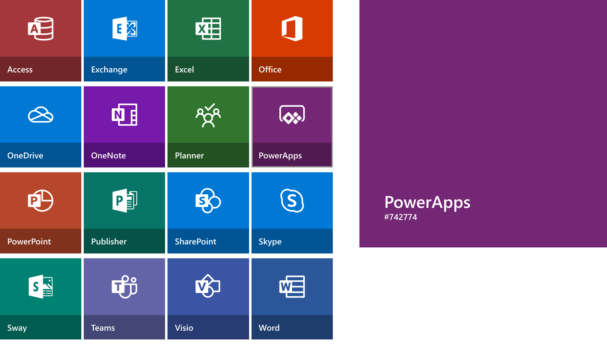
Taking a closer look at a real-world example, the following image outlines parts of the Microsoft Fluent design system, visually representing the different colours used for product recognition. It provides a hex value along with an associated name for the colour. These values can be abstracted into what is known as a design token.
Design Token Library
Design tokens set up a number of foundational constraints that a design system establishes from its style guide; they also provide an opportunity to establish a common language between disciplines. For example, it is not ideal if a designer talks about blue-400 when an engineer is requesting a hex value. In this instance, blue-400 could have been updated in the style guide by another team since the last time they checked. For an overview on design tokens I recommend checking out the following video to get up to speed before reading further.
When you begin building your design system, your use case will dictate how you establish these tokens. When you boil it down, these are simply variables, but you should ask yourself in which format do you need these variables to be available in? If you're building a web app along with an iOS app, you'll likely need them in different formats to support both. You may also need another format for your application elements that don't live in your component library. Having a single source of truth for design tokens will make updating your style guide and applications much less painful.
One of my favourite tools available for this is StyleDictionary as it provides an easy way to establish a shareable library of design tokens. You can define tokens using whatever structure you desire using either .yml or .json formats and it provides some excellent community-driven Figma plugins too.
color:
  base:
    access:
      value: '#a4373a'

    exchange:
      value: '#0078d4'

    excel:
      value: '#217346'

    office:
      value: '#d83b01'

    onedrive:
      value: '#0078d4'
Your config file will determine how the tokens get transformed. You can choose from a number of built-in transformers or you can write your own transformer if you need to support a less commonly used platform. You can also use StyleDictionary to store assets as well if you wish to establish a single source of truth for things such as logos and font files.
{
  "source": [
    "tokens/**/*.json"
  ],
    "platforms": {
      "web": {
        "transformGroup": "web",
        "buildPath": `build/web/`,
        "files": [{
          "destination": "tokens.scss",
          "format": "css/variables"
        }]
      },
      "ios": {
        "transformGroup": "ios",
        "buildPath": `build/ios/`,
        "files": [{
          "destination": "tokens.h",
          "format": "ios/macros"
        }]
      }
    }
  }
}
The configurations above will build the following outputs which you can then distribute on each respective registry. This way each platform can get the latest updates once you've made them available. It’s important to note here that you should embrace the idea of change as style guides evolve over time. If you need to make an update to an existing colour, for example, having a distribution system for your tokens makes updating every application easier. The less manual work that needs to be done will move you closer to the goal of consistency and efficiency.
:root {
  --color-base-access: #a4373a;
  --color-base-exchange: #0078d4;
  --color-base-excel: #217346;
  --color-base-office: #d83b01;
  --color-base-onedrive: #0078d4;
}
#import <Foundation/Foundation.h>
#import <UIKit/UIKit.h>

#define ColorBaseAccess [UIColor colorWithRed:0.643f green:0.216f blue:0.227f alpha:1.000f]
#define ColorBaseExchange [UIColor colorWithRed:0.000f green:0.471f blue:0.831f alpha:1.000f]
#define ColorBaseExcel [UIColor colorWithRed:0.129f green:0.451f blue:0.275f alpha:1.000f]
#define ColorBaseOffice [UIColor colorWithRed:0.847f green:0.231f blue:0.004f alpha:1.000f]
#define ColorBaseOnedrive [UIColor colorWithRed:0.000f green:0.471f blue:0.831f alpha:1.000f]
Supporting Multiple Themes
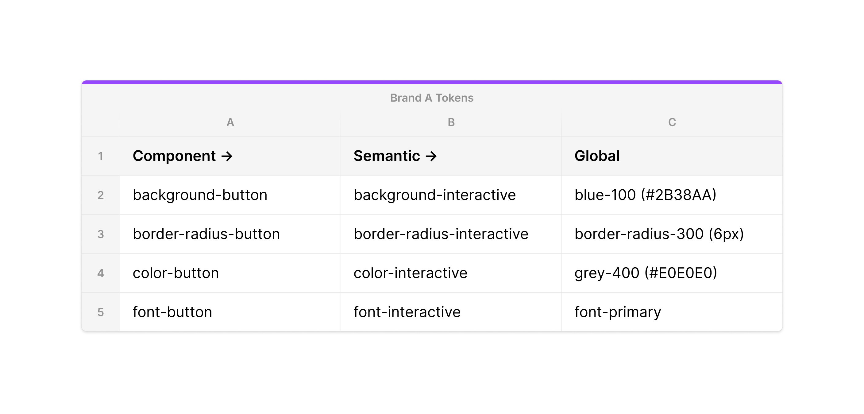
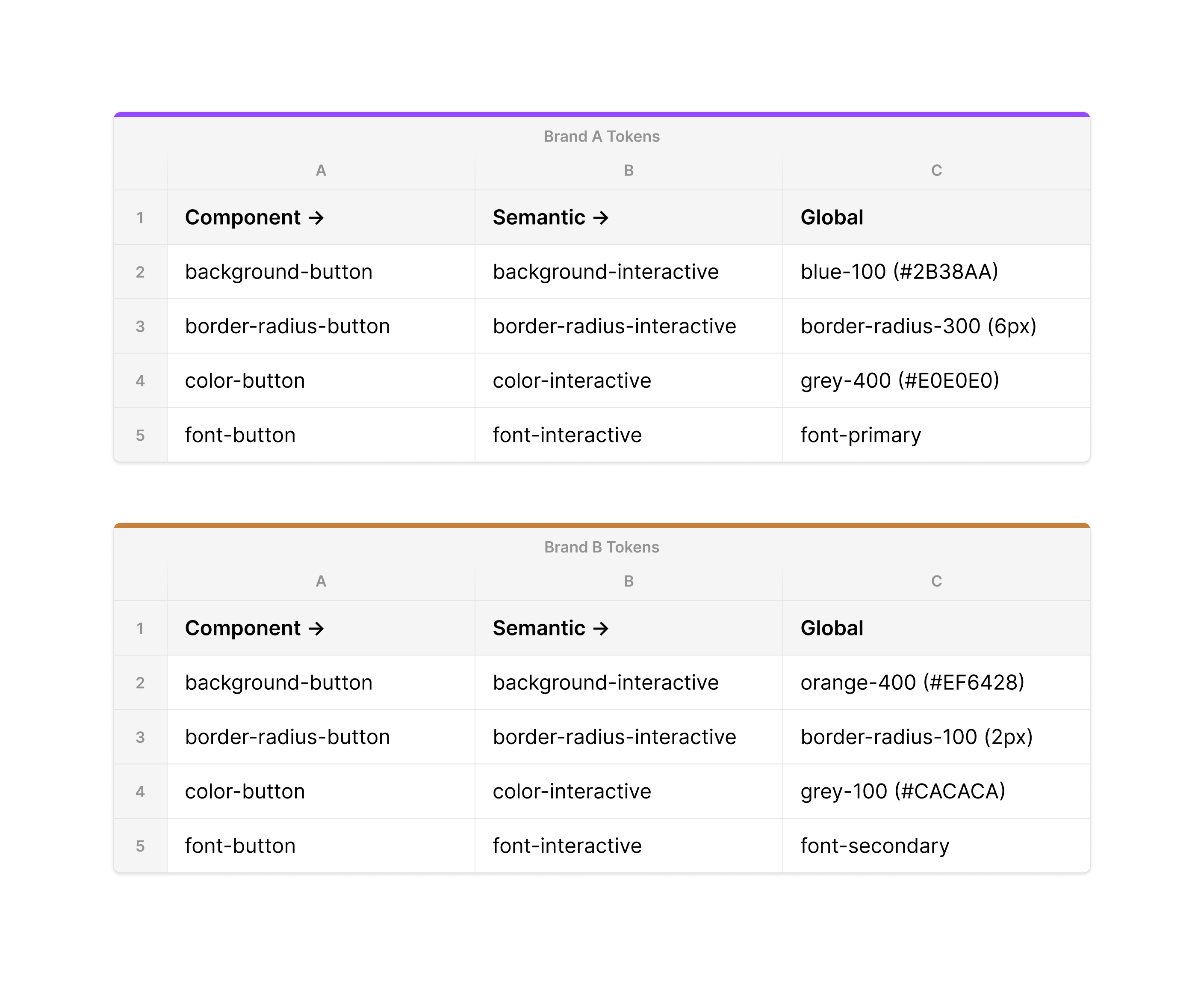
It's becoming more common for applications to support multiple themes. Either that be light and dark mode, different colour schemes, or even different brands. The way you structure your tokens will make such a transition easier. One popular way of structuring tokens for this is using global, semantic (alias) and component tokens. In the following table, the component tokens inherit from the semantic tokens, which inherit from the global tokens (provided in the style guide).
If we were to translate this structure into CSS it would look something like the following.
:root {
  --background-button: var(--background-interactive);
  --border-radius-button: var(--border-radius-interactive);
  --color-button: var(--color-interactive);
  --font-button: var(--font-interactive);
}

.btn {
  background-color: var(--background-button);
  border-radius: var(--border-radius-button);
  color: var(--color-button);
  font: var(--font-button);
  padding: 20px 10px;
}
Elsewhere in the application, we'd import a variables file that maps the global tokens to the base tokens. In code the global tokens would not be surfaced, instead only the compiled semantic tokens.
:root {
  --background-interactive: #2b38aa;
  --border-radius-ineractive: 6px;
  --color-interactive: #e0e0e0;
  --font-interactive: Helvetica;
}
If the interactive colour of all components needs to change in the future, using this system makes it as simple as just pointing it to a different base token. This structure allows you to update a global token across the entire design system, while still supporting changes at the component level if needed. Using a tool such as StyleDictionary you can export two sets of variables for different themes. So long as they share a common token structure, it will update every instance of our components across the system. Given the following example, our CSS can remain the exact same but the button will have a different colour scheme simply by changing out the CSS file that maps the global tokens to the global tokens.
You can see this translated into each variant below. The buttons look different from each other but they have some degree of consistency provided by the padding.
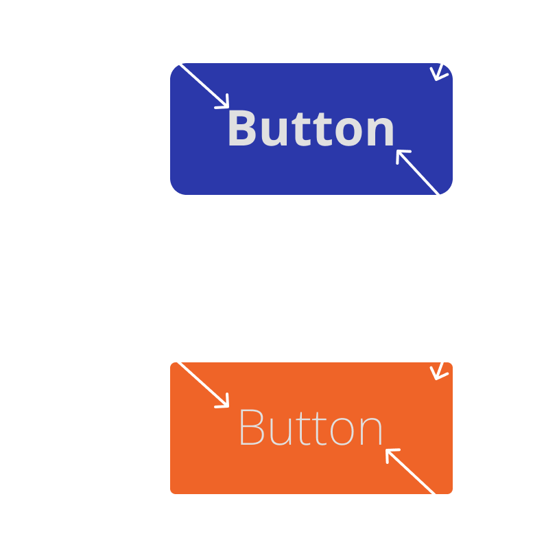
This is how companies such as Microsoft and Tribune Publishing handle this for their numerous publishing houses. There are commonalities in their designs but they have tokenized things such as colours and fonts allowing them to share designs across their products while still giving each brand its own degree of identity. This system will only scale to a point, however, and if you find yourself tokenizing every possible property on a component you should consider asking yourself about the end goal of what you’re trying to achieve: is it a theme or a new component?
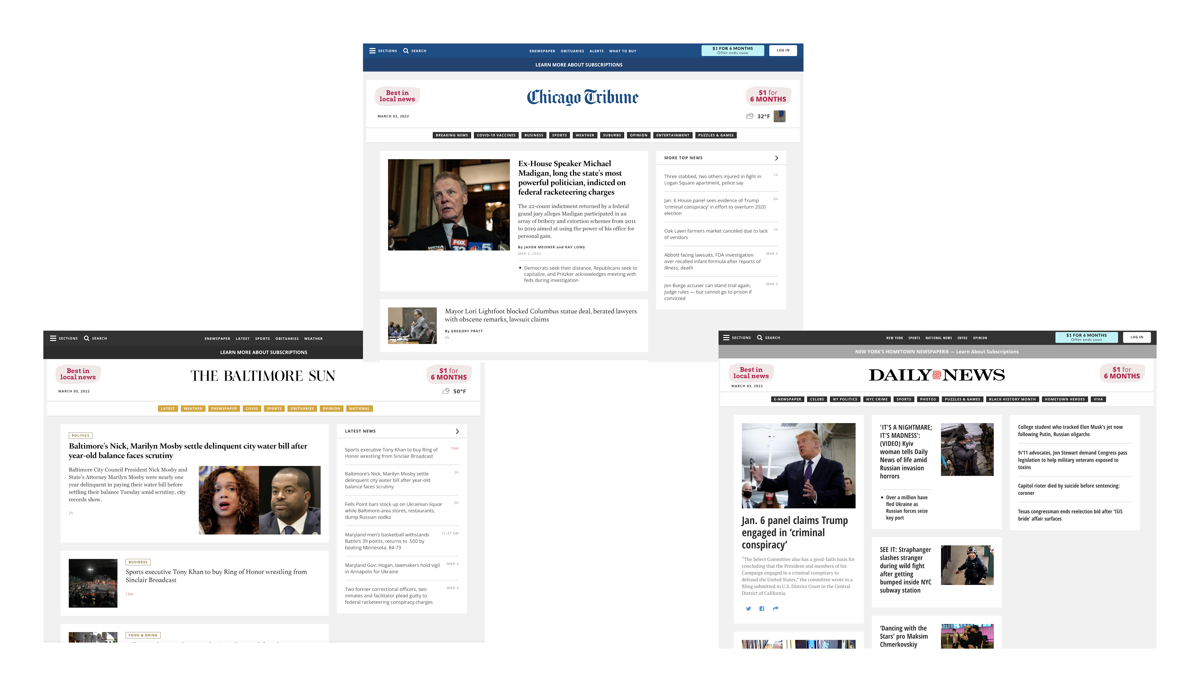
Disclosure: I was involved in the development of the Tribune Publishing examples above during my time at The Washington Post in 2017.
Engineering the Sharables
Another deliverable of a design system is a component and utility library. While this next area will focus on possible web engineering approaches it's important to acknowledge that this solution will not work for all platforms. If you need to support a native iOS app it cannot share the same component library as your web implementation. Your needs today don't necessarily reflect your needs tomorrow and having a robust token structure that can be shared along with documentation will make the transition smoother if later down the road you need to support multiple platforms or contexts.
Utilities
In many examples of design system driven libraries, you'll see a degree of utility classes available. These are often used to apply base tokens to an element.
For example, you may have a utility class to apply a specific color value or a certain font or padding size. At the core of these utilities, it's just referencing a variable that you have available at :root.
.text-2xl {
  font-size: var(--base-text-2xl);
}

.font-display {
  font-family: var(--base-font-display);
}

.color-white-200 {
  color: var(--base-color-white-200);
}

.px-400 {
  padding: 0 var(--base-size-400);
}
<h1 class="font-display color-white-200 px-400 text-2xl">
  10 Reasons Why Montezuma is the Best Cat in the World
</h1>
This provides an easy interface for consumers of your library to work with the constraints established by your design system. If your style guide prescribes a finite amount of spacing options allowed then you can provide all of the options for an engineer to easily implement a design using it through variables and classes. The same can be applied to things such as colours and so on. On the flip side, if a team doesn't want to use utility classes and prefers to write their own stylesheets they still have the option available to them of using variables.
Making your library as modular as possible will aid with the adoption of it. A team should be able to pick and choose which parts they need of your system to keep their application as performant as possible. There are numerous tools you can use to aid with this process such as Sass, PostCSS and TailwindCSS.
// @import '@brand/design-system/utilities'
@import '@brand/design-system/app/components/button';
@import '@brand/design-system/app/components/input';
Components
Components are building blocks that you can use to form user interfaces. These can be buttons, inputs, alerts and so on. Components should take into consideration accessibility best practices to ensure a good user experience, the required markup structure, and so on. In the case of a button component, you would have utilities for all of the variants, and all of the variants would have an appropriate hover and focus state that is recommended by the style guide. If a user of your design system needs a button the provided code snippet should be everything they need to get started. If supporting multiple themes, you should consider leveraging different types of global and semantic tokens as mentioned earlier.
:root {
  --background-button: var(--global-background-interactive);
  --color-button: var(--global-color-interactive);

  --background-button-hover: var(--global-background-interactive-hover);
  --color-button-hover: var(--global-color-interactive-hover);

  --background-button-focus: var(--global-background-interactive-focus);
  --color-button-focus: var(--global-color-interactive-focus);
}

.button {
  background-color: var(--background-button);
  color: var(--color-button);
  padding: var(--base-size-400);
  transition: 100ms opacity ease-in;
}

.button:hover {
  background-color: var(--background-button-hover);
  color: var(--color-button-hover);
}

.button:focus {
  background-color: var(--background-button-focus);
  color: var(--color-button-focus);
}
<button class="button">Click me</button>
As a best practice, you should avoid writing components for a specific framework such as React or Angular and instead opt for a CSS first approach. It's much easier to sell migrating to a sharable solution than it is pushing for entire application re-writes especially if you have multiple frameworks being used, it's also simply not practical. Another benefit for providing components as CSS is that it allows teams to spin up derivative libraries using your design system. It could make migration easier if they already have an established component library they are using for a specific framework as all it would take is to simply update some class names. Ultimately, providing implementation at the most sharable level possible provides choice and flexibility for your target audience.
You may also want to consider the native Web Component API depending on what your needs are. Web Components are great for interactive components and also provide styling encapsulation which further shields your components from being modified by inherited CSS. There are many resources available for web components such as Lit and Stencil. The above example could instead be an HTML element that encapsulates all styling and accessibility concerns. Keep in mind that with anything sharable it’s never a good idea to bake business logic into this type of component.
<action-button> Click me </action-button>
Documentation
Your design system needs to live somewhere. The culmination of knowledge across design and engineering needs to be accessible to every stakeholder, including people who don't need to use it on a day to day basis. The documentation should reference both the engineering and design implementation along with the do and don'ts of using each component and utility. It should provide real-world examples, information about contribution, ownership and so on. The documentation should flow easily and allow consumers an easy path forward to using the system that you provide from both an engineering and design perspective. Additionally, you should consider providing a pattern library that highlights commonly used interface patterns so you can lean even further into the goal of consistency.
There are plenty of tools available out on the market that can help achieve this such as Storybook, Docz and Invision’s Design System Manager. Take a look at some of the existing open-source design systems and see what they leverage and make your best judgement.
Closing Thoughts
Before you begin setting out on a journey to build a design system, you should align on a set of objectives and goals that you hope to achieve by implementing such a thing. This will ultimately help with buy-in across different teams and speed up the adoption process. This article covers a lot of ground but there's no real right way to do this. Each system is different and the path you choose is ultimately up to you. If you're interested in reading about a design system I've built in the past click here. Otherwise, I hope you enjoyed the article!
Related Reading
- Let's Chat About Design System Tokens
- Syncing Figma Variables with GitHub Actions and StyleDictionary
Huge shoutout to Melissa Eckels for the hand with editing this article!