There's a whole sea of tools out there to help you generate your own sprite sheets. In the past I've used Adobe PhotoShop, but you can simply Google "sprite sheet generator" and you'll find hundreds of options online.
Monte Says
Sprite Sheets are used in everything from computer games, physical devices and even the web. They are a great way to build and combine image and icon variations in an optimized way. Some benefits to using a sprite sheet include limiting the amount of roundtrips a user needs to make to fetch your resources, and they also tend to be smaller in size compared to loading each asset individually.

Leveraging CSS we can even apply animation and interaction states using a sprite sheet. If you ever participate in a game jam (a hackathon for creating games) or something similar they can be incredibly useful, especially if a size limit is involved. In this post we'll explore sprite sheets in the context of web applications and cover some of the tools at your disposal when working with them. We'll also animate a sprite of my cat Montezuma, because, well... this is my blog and I do what I want.
Each sprite sheet consists of a series of static images. They can vary in size, colour, and composition, so long as the individual images don't run into each other.
Let's look at this icon sprite sheet as an example that contains multiple different variants. Each icon is equally spaced out, with 5px of padding between each icon and randomly placed in no particular order.
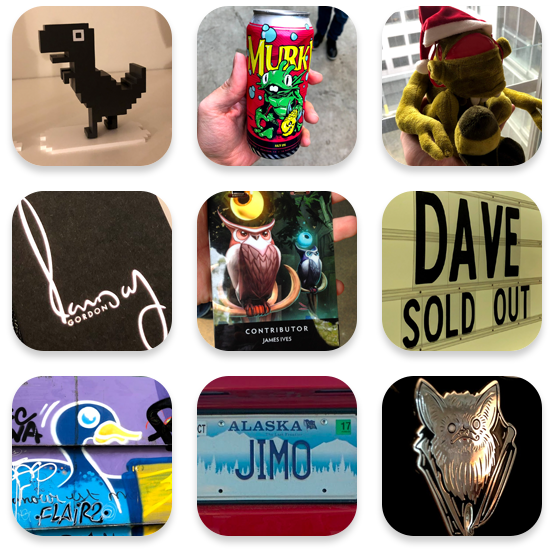
Displaying a single item from a sprite sheet is pretty simple. Using CSS we'll create a div and set the background to the sprite sheet image. We'll also set the no-repeat property.
// <div class="spritesheet-icon"></div>

.spritesheet-icon {
  background-image: url(/images/blog/2020-12-12-animating-sprite-sheets-with-css/spritesheet_icon.png);
  background-repeat: no-repeat;
  display: block;
}
By default this doesn't display anything and that's because we haven't yet configured a viewport area. Because I created this sprite sheet I know that each image in the sprite sheet is 175px in height and width. We can set our height and width properties to that, and then use the background-position property to position the sprite sheet so each icon fits correctly within the viewport.
I've tried to demonstrate this in the image below. The green area represents the viewport div, and the red area represents what is happening behind the div, invisible to the user. Because we're not setting a background-size property the background image will remain a consistent size and not adjust to the size of the container displaying it.
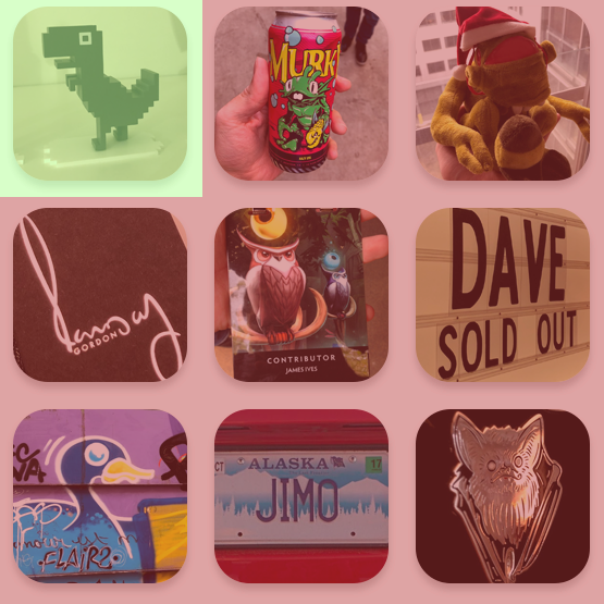
As there is 5px of padding between each icon in the sprite sheet the starting position would be -5px -5px, to move to the right we'd add 10px (the combined horizontal padding between two icons) plus the width of the icon, so 5 + 10 + 175 = 190, which would make the second icons background-position -190px -5px. We can keep following that logic all the way through the sprite sheet.
.spritesheet-icon {
  background-image: url(/images/blog/2020-12-12-animating-sprite-sheets-with-css/spritesheet_icon.png);
  background-repeat: no-repeat;
  background-position: -380px -5px;
  display: block;
  height: 175px;
  width: 175px;
}
As all we're doing to toggle between each icon is adjusting the background-position property we can configure our style sheet to toggle between each one with a class name. We can also combine this with pseudo selectors to create an effect when the user interacts with the icon. This can be particularly useful if your sprite sheet contains hover or focus variants of an icon.
.spritesheet-logo {
  background-image: url(/images/blog/2020-12-12-animating-sprite-sheets-with-css/spritesheet_icon.png);
  background-repeat: no-repeat;
  display: block;
  height: 175px;
  width: 175px;

  &--downasaur {
    background-position: -5px -5px;

    // On hover display the can icon
    &:hover {
      background-position: -190px -5px;
    }
  }

  &--vort {
    background-position: -380px -5px;
  }

  &--license-plate {
    background-position: -190px -380px;
  }
}

// <div class="spritesheet-logo spritesheet-logo--vort"></div>
Sprite Sheets can be a bit of an issue from an accessibility standpoint. When a screen reader interacts with our sprite sheet element it's not going to recognize it as an image, instead just an empty div element. Depending on what the sprite sheet is representing you may need to include some descriptive text to the element that renders it. There's a number of ways to do this, but one solution is to apply text to the element with a class that makes the text invisible to non-screen reader users. This way you're able to display the sprite sheet icon as it's intended, while making it descriptive and accessible for screen reader users as the text will be read out for them.
.sr-only {
  border: 0;
  clip-path: inset(50%);
  clip: rect(0, 0, 0, 0);
  height: 1px;
  overflow: hidden;
  padding: 0;
  position: absolute;
  white-space: nowrap;
  width: 1px;
}
<div class="sprite-sheet__logo">
  <span class="sr-only"> Montezuma Industries logo </span>
</div>
There's also a number of applicable roles and aria-labels which may be more appropriate depending on your use case. Ensuring that your page is accessible should be a top priority, and it's important to recognize the fall backs of rendering images in this fashion.
Using CSS you can animate sprites sheets using keyframe animations. If you're unfamiliar with keyframe animations they let you define simple animation with CSS properties using a scaling system from 0-100%.
In this example let's take this sprite sheet of Montezuma the Ginger, the greatest wizard in all of the land. This sprite sheet represents a walking animation, and each image makes up a part in the cycle.

The sprite sheet is 616px wide and 52px tall, and there's 8 frames. To determine the viewport area we need to divide 616 by the number of frames, resulting in 77px. As a result of this we know that each frame will need to move by 77px each time across the X axis.
The following is the configured keyframe animation that should adequately distribute each frame transition. To ensure that the loop remains seamless I've applied the same starting image to the last keyframe in the animation.
@keyframes walkAnimation {
  0% {
    background-position: 0px 0px;
  }

  12.5% {
    background-position: -77px 0px;
  }

  25% {
    background-position: -154px 0px;
  }

  37.5% {
    background-position: -231px 0px;
  }

  50% {
    background-position: -308px 0px;
  }

  62.5% {
    background-position: -385px 0px;
  }

  75% {
    background-position: -462px 0px;
  }

  87.5% {
    background-position: -539px 0px;
  }

  100% {
    background-position: 0px 0px;
  }
}
We can combine keyframe animations with a series of timing properties to determine how fast each style should be toggled, looped, delayed, etc. For this I'll set the animation to walkAnimation, and set a 1 second duration with an iteration count of infinite so it loops. If we combine this with our base CSS properties we'll end up with something that looks a bit strange.
.montezuma {
  animation: walkAnimation;
  animation-duration: 1s;
  animation-iteration-count: infinite;
  background-repeat: no-repeat;
  background-size: cover;
  display: block;
  height: 51px;
  width: 77px;
}
The reason this occurs is because it's smoothly animating between each position in the keyframe. In order to fix this we need to apply a animation-timing-function property to specify the curve of the animation. For this example we'll set animation-timing-function: steps (1, end) to tell it to only transition between the start of each frame. This results in a more natural looking walking animation.
Because our sprite sheet consists of pixel artwork we need a better way to scale it up without increasing the actual size of the sprite sheet. This can be achieved by setting the image-rendering property to crisp-edges, this will preserve the edges when something is scaled as opposed to trying to apply anti-alising. In some browsers you need to set this property to pixelated as a fallback. We can then also apply a scale function to increase the size. You can find an example of this below.
.montezuma {
  animation: walkAnimation;
  animation-duration: 1s;
  animation-iteration-count: infinite;
  background-repeat: no-repeat;
  background-size: cover;
  display: block;
  height: 51px;
  width: 77px;

  // Enhance!
  image-rendering: crisp-edges;
  image-rendering: pixelated;
  transform: scale(4);
}
This will result in our pixel artwork being much bigger, while still maintaining the original height and width for its animations. This technique will work on any image, but it's particuarly useful for pixel sprites as it maintains their overall look and feel.
You're able to tie multiple animations together with the use of JavaScripts animationstart and animationend event listeners. These work similar to other event listeners where the callback function will fire after the keyframe animation has started or concluded.
const element = document.querySelector('#animation-element')

element.addEventListener('animationstart', () => {
  // The associated keyframe animation has started
})

element.addEventListener('animationend', () => {
  // The associated keyframe animation has ended
})
These can be particularly useful when tying animations together as you can use these to add/remove associated classes for a specific animation in order to play another.
In my example I have two keyframe animations I want to toggle between, one where Monte is reading a book, and the other where he's running. As the book animation doesn't loop we can use the animationend event listener to wait for it to end, and then toggle the class to the running animation.
const element = document.querySelector('#animation-element')

element.addEventListener('animationend', () => {
  element.classList.remove('animation--book');
  element.classList.add('animation--run');

  // After 500ms remove the running animation and reset to idle.
  setTimeout(() => {
    element.classList.remove('animation--run');
    element.classList.add('animation--idle');
  }, 5000)
})
In a real world example such as a game the walking animation could be used when a user presses the walking keys, and the reading animation could be used when the reading button is pressed. We'd then use the event listener to figure out once the reading animation is done, toggling the sprite back to the animation that indicates some sort of idle state. Animation toggling such as this is surprisingly easy with just a little bit of JavaScript.
Thank you for reading, next time you play a game that uses sprites see if you can figure out how the animations tie together, hopefully after reading this article you'll be able to look through the Matrix. The cat artwork in this post was created by Alisaart.
I was also recently interviewed by GitHub surrounding my open source contributions to the GitHub Actions platform. You can check out the interview here. Besides that I hope you all have a safe new year and a great holiday season. Here's to hoping 2021 is a little better.